The Reason Why Everyone Loves Minimalist Interior Design
Minimalism rules the roost. Be it fashion or poetry, this trend leaves a never losing impact on every one. Especially minimalist interior design creates a buzz where the designers deal with the most essential things and discard all that is superfluous.
The American visual art is considered to be the mother of minimalist design; and even though it originated in the late 1960’s and ‘70s, it was strong enough to get into the industrial trend. Minimalism was more focused on rejecting the subjective design of abstract expressionism. However, the spontaneity shouldn’t have gone missing. The culmination of multiple design trends allowed minimalism to proliferate and get into the mainstream.
How effective is minimalist interior design and why does it get so popular? Let’s hunt down the reasons and find how your room can look better.
How Less is Always More!
With the use of geometric abstraction, the art of minimalist interior design started its journey. Since post-modern art has left its impact strong on all creative forms, interior design industry was not out of it. Geometric art forms dealt with sharp lines and curves giving focus on clean edge and a de-cluttered form. Stuffing your home with too much of elements was completely done away with, and the priority was given on usability and aesthetic considerations of the room. Limit your interiors to functional elements that will also stand out drawing the attention to the actual content.
Is Functionality Overrated? Not In Interior Designing
It’s definitely hard to achieve, but it is the essential thing to uplift the interior design of your home. Remove all the unnecessary stuff and end up with something that is sure to make you feel more jovial and also peaceful. For instance, limit yourself to furniture that is highly essential, like a high-sofa, chair, and a bed. Incorporate prints and designs only on the wall; avoid them as much as you can on the upholstery. Keep the interior functional, yet splendid to look at.
Open space filled up with proper lights is a trend in minimalist design
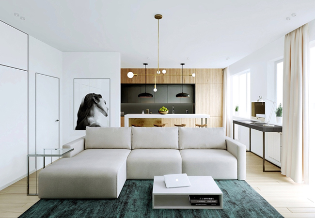
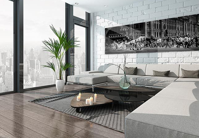
In the minimalist interior, an open, wide floor between the living space and kitchen allows an abundance of light to fill up space. A light colored surface of the wall and neutral color palette gives your room indeed a mesmerizing look you always dream of. A king size room with light of white or yellow tone coupled with uncluttered, contemporary furniture is also typical of minimalist interior. Only the necessary decorative pieces are used so as to give the room some kind of breathing space. The abundance of the natural lights can indeed add an aesthetic edge to the room’s interior, thereby making you feel cozy rather than gloomy and melancholic the moment you step inside.
In a nutshell, eye catching yet simple interiors can stand out on its own without the need for all the knick-knacks in order to clutter up.
Interested to give your apartment a minimalistic look? Arcline Décor is the one stop destination for all your interior décor needs. View our portfolio and catch a glimpse of our work here.


0 comments